Pentagram's DJ Stout: There Needs To Be More Storytelling In Graphic Design
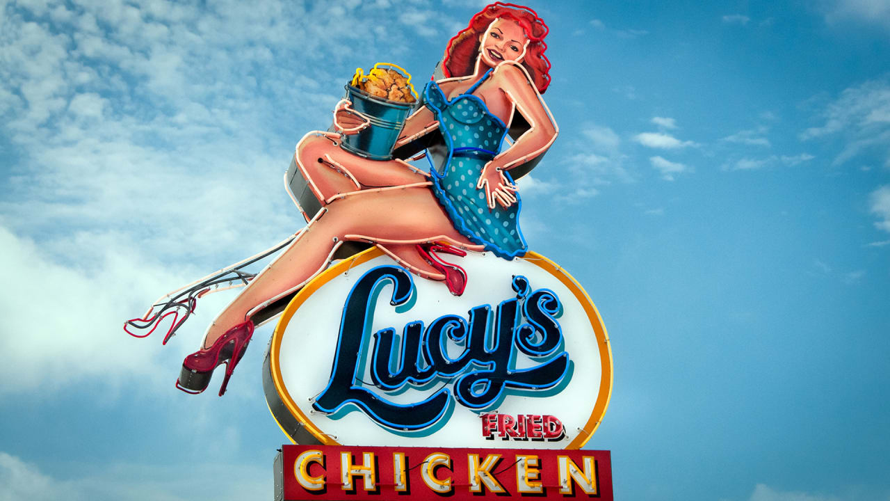
The cover of Texas Monthly's July 1992 issue features an portrait of then governor Ann Richards sitting on a Harley-Davidson motorcycle. She's dressed head to toe white leather, her hair is coiffed in her signature gray bouffant, and she stares confidently at the camera. To DJ Stout, the cover's designer, this portrait of Richards, 60 years old at the time, was "the perfect metaphor for capturing her salty wit and irreverent personality," he once wrote. In a fleeting glance, readers knew it wasn't business as usual at the Texas statehouse. The audacious concept is also one of the perfect examples of Stout's evocative, eclectic approach to visual design.
A partner at Pentagram since 2000 and art director at Texas Monthly from 1987 to 1999 (it was nominated for 10 National Magazine Awards, the print industry's Oscars, during those 13 years), Stout has built his career on a single mantra: solve the problem, don't decorate. To accomplish this, he calls upon an arsenal of expressive typography, custom artwork, brash colors, and nods to history, never limiting his work to a Helvetica straight jacket.
During his 35-year career, the Austin-based designer has worked on corporate identities and branding, wayfinding and signage, and apps and websites, but it's still ink on paper that gets his blood pumping. "I’m very much an editorial animal," Stout says. In Variations on a Rectangle, his new monograph from the University of Texas Press, Stout chronicles the projects that demonstrate his problem-solving approach. We spoke to the designer about his strategy.
Solve The Problem, Don't Decorate
Though Stout's work is certainly more expressive than that of many other Pentagram partners, there's a clear purpose. "Like most designers, I don’t really start to conceive of an idea until I really understand what the problem is," Stout says. "One of my philosophies is solve the problem, don’t decorate. And I think that maybe some designers get on the computer and start decorating and say, 'Oh I like this typeface' or, 'Oh I like these colors.' What I like to do is figure out what we’re trying to communicate and really get that in my head."
Tell A Story
Stout, a fifth-generation Texan, is a natural storyteller. He moved around a lot as a child so he illustrated comics and newsletters to get to know his classmates and neighbors. "Because of my editorial background I believe that everything we do is about storytelling," he says. "Whether it’s a design or a package, it needs to tell you a story. It needs to tell you something."
About 70% of the projects Stout and his team work on are editorial, which includes printed matter, websites, and apps; 25% is branding and corporate identity; 5% are miscellaneous projects. "The thing I like more than coming up with a logo is figuring out how it actually works in an identity systems to fulfill a client's needs," he says. "That’s where it gets in to storytelling—what are all the elements of the identity and how do they work together to tell a story."
Production Goes A Long Way
Stout believes that new school graphic design can benefit from old school techniques.
"I like to use illustrators, I like to use photographers, and I like using type in a very illustrative way," Stout says. "Nowadays because of technology, because of computers, because there’s so much stock photography and illustration, it’s really hard to get clients to take that leap of faith when you’re going to assign original illustration or photography. It’s harder and harder. Part of it is work needs to be completed faster. And what that takes out of the process is the gestation period that you really need to sell an idea that’s going to take some time, money, and travel. Maybe they'll opt to just use stock or maybe just go with a type solution that you could do very quickly."
The need for speed and the ephemerality of design on blogs and websites leads to another byproduct, according to Stout: a proliferation of easily accessible, gorgeous images that have little substance behind them. "I think there’s more eye candy being put out there that’s really great to look at, like a really terrific-looking design, really beautiful type, colors, cool image," he says. "But I think what’s missing is that quality of storytelling because of that you look at it and say, 'That’s cool' but it doesn’t really tell you anything."
It's Not Always About Restraint
The design solution depends on the client and audience, but flipping through Stout's book shows that he's not afraid of a serif.
"As Paula Scher wrote in the introduction to the book, a lot of Pentagram's partners—particularly the London partners—have a kind of a clean modern sensibility," Stout says. "And I can do that and have done that very simple, very spare design. But more so than the other partners, sometimes I’ll lean toward expressive work, and I’m not afraid to go there as long as it solves the problem, as long as it’s actually communicating what that service is or what the message."
"As opposed to just setting beautiful sans-serif type on a simple white page, I really want there to be some notion of an idea—some concept," Stout says. "I’m always, always trying to find that. Sometimes that idea could be actually portrayed by pure simplicity and that’s fine. It’s the idea that drives the look."
Design For the Medium
"My heart and soul is really still magazines and books," Stout says. "A magazine is kind of like a movie. It’s cinema. There’s a pacing to it. Maybe there’s a big photo and you go to a page with multiple things, and you go to another page that has a different feeling."
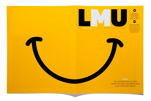
Stout's firm also frequently works on multi-platform editorial projects. For a Loyola Marymount University story on two basketball players facing off in a game of Horse, he opted to format the magazine story as a survey on who the students thought would win. On the website, viewers could watch the game take place. On the tablet app, viewers had access to all the images from the photo shoot. "They were all talking to one another, leveraging one another," Stout says of the treatment. "It was taking one story and doing it in different mediums."
Don't Get Tripped Up In the Mechanics
Stout got his start pre-Photoshop, working on mimeograph machines as a kid. When he started at Texas Monthly, the office didn't have a computer and worked with in-house typesetters and paste-up artists.
"What I think is overrated [in today's design conversation] is a real emphasis on technology," Stout says. "Obviously, if you’re designing websites and apps there’s going to be a lot of discussion that ends up being very technical. But I’ve been around other designers or in meetings where the entire discussion is sort of technical gobbledygook. What gets lost, a little bit, is a discussion about ideas. Because there’s so much emphasis on the mechanics and technology, ideas get left by the wayside."