9 UX Secrets I Stole From People Smarter Than Me
Like most people, I like to think I have good taste. But if I do, it’s only because I’ve been ruthless about one thing: stealing secrets and strategies from people a lot smarter than me.
I’m fairly new to the UX field, but I’ve had the good fortune of being exposed to world-class designers who’ve worked for Ideo, Google, CapitalOne, and the Nielsen Norman Group to name a few.
Some I met in person, and others I encountered through books and presentations. Whether they knew it or not, I was listening closely and took from them what I thought were their best ideas about design. Below are the secrets I learned from them
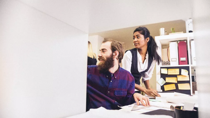
1. Observe What People Create
Dan Makoski, vice president of design at CapitalOne
From Makoski I learned that there are just three ways to understand people: what they say, what they do, and what they make. Most traditional research is based on what people say. This includes surveys, interviews, focus groups, and the like. The problem is that most people do very different things than what they say.
Observing people’s behavior gives you deeper insights, but the deepest insights come from what people make. Any animal can consume, but only humans create.
Makoski taught me to bring regular people into the middle of the design process and give them materials to build their dream solution. All you need are simple tools like paper, Post-It notes, Sharpies, and Play-Doh.
This is the secret weapon Makoski used to design the Microsoft Surface, the Moto X, and Project Ara at Google. You’ll be blown away by the creative things that people make, and the complex problems they solve.
2. Design For Mobile First
Luke Wroblewski, founder of Polar
From Wroblewski I learned just how important mobile design is. In the US, 78% of Facebook’s monthly active users are on mobile devices, and for Twitter, it’s 75%. The main experience for these services is mobile-driven.
Global sales of personal computers has been decreasing since 2010, and smartphone and tablet sales have skyrocketed. And out of TV, radio, print, desktop and mobile, the only form of media that’s currently growing in the U.S. is mobile.
A lot of people think that mobile is mainly just for entertainment, like playing games and social networking. But the category that’s growing the fastest is what Wroblewski calls "utilities," which means things like shopping, planning travel, managing finances, and getting stuff done.
Designing from the desktop first is a backwards way of thinking in this era. We need to be designing for mobile first. And there are a lot of things that fundamentally change when you make that transition: your processes, the way you work through the design, the mockups you show people, and how you design the design. They all change.
3. Fuel Your Design With Empathy
Paul Bennett, chief creative officer at Ideo
Bennett taught me to put myself in other people’s shoes, feel what they’re feeling, and then use that information to find solutions. Often times the best ideas are so obviously staring us in the face that we miss them, he says. We can’t see them because we’re looking at things from the outside in, instead of looking at things from the eyes of the user.
In one of his TED talks, he gives the example of a hospital that wanted Ideo to describe its patient experience. When Bennett's team presented their findings to the hospital, they showed a 5-minute video clip of the ceiling in a patient’s room. The managers were confused at first, but the point was that when you’re lying in a hospital bed all day, all you do is stare at the ceiling for a very long time. That’s what it’s like to be a patient in the hospital.
The managers realized that improving patient experience wasn’t about making huge changes to their system, it was about tiny things that can make a huge impact. So they jumped into action and made a few small changes.
For example, they decorated the ceiling. Then, they changed the flooring in the patient’s room, so that it signified this was personal space. They also put a big whiteboard on a wall in each room so that visitors could write messages to the person who was sick in that room.
What are the tiny solutions that could make a huge impact on your users’ experience?

4. You Can’t Design Experiences
Liz Sanders, design professor at Ohio State University
Sanders is considered the mother of co-creation and participatory design. She taught me a controversial lesson that helped take my ego out of the creative process. In one of her papers she said, "There is no such thing as experience design."
This confused and irritated me at first, until I learned her definition of experience. It’s a moment in time that’s felt individually. It’s inside of each us, and it exists where our memories meet our dreams.
We might not understand the meaning of a particular experience for weeks, months, or even years after it happens. So, if we can’t even understand our own experiences, how can we be so egotistical to think we can design someone else’s? We can’t.
But Sanders says even though we can’t design experience, we can design FOR experience. That one small three-letter word makes a world of difference.
5. Your Baby Might Be Ugly
Tim Ash, founder of SiteTuners
Ash made me realize that the less I talk to users, the more ignorant and blind I become. I start to make all sorts of assumptions that are wrong. Anytime I’m working on a creative project, I start to get tunnel vision, like a parent who thinks his baby is beautiful and perfect.
But parents don’t have an objective point of view. They created and nourished that child. They spend more time with him or her than anyone else. I’m just as invested in my own projects.
I might think my designs are beautiful and perfect, but my users’ opinion is the only one that matters. I learned to get feedback from my users as often as possible, and use it to iterate and improve my design over time.
6. Test Your Design As Early As Possible
Marieke McCloskey, director of research at UserTesting
Before she began working at UserTesting, McCloskey was a UX specialist at the Nielsen Norman Group. She taught me the importance of testing my design as early as possible.
Whatever I’m working on isn’t going to be perfect. And since my users don’t think the same way I do, I’m inevitably going to run into design issues. A feature might be broken, confusing, or just straight up frustrating.
There’s no way to tell without getting feedback from real human beings. And if I can get that feedback early in development, changes can be made without having to waste a lot of resources.
7. Study The Human Mind
Derek Halpern, founder of Social Triggers
From Halpern, I learned that understanding the human mind is the most important skill you can develop for designing for the web. The human brain has been hard-wired over thousands of years of evolution, and even though technology is rapidly changing, the mind still works like it always has.
He taught me that there are invisible forces that can be used to persuade and influence users in an ethical way. If you want to be a better designer, study people. Learn what makes them tick and why they do what they do.
As you begin to identify psychological principles, figure out how you can apply them to your design. The better you understand what motivates human behavior, the more effective your designs will become.
8. Design To Make Life Better
Leah Buley, analyst at Forrester Research
Buley showed me that the quality of our interactions with software and hardware matters more now than ever. The magic is no longer in the technology. It’s in the technology’s ability to make life better.
The most important questions I can ask myself are: Does this solve a problem that my user truly cares about? How can I make this interaction feel simple, relevant, and even magical?
9. Design For Scanning
Steve Krug, author of Don’t Make Me Think
From Krug I learned that the way I think people use websites is different from how they actually use them. When I’m coming up with ideas for a page design, I tend to think that people are going to slowly read all of the information, and once they’ve considered all of their options they’ll make a rational choice that’s best for them.
Unfortunately, that’s just not reality. Most of the time, users glance at the page, scan some of the text, and click the first link that catches their attention or seems to resemble what they’re looking for.
So, if people are just going to scan the page, design for scanning instead of reading. Break up pages into clearly defined areas. Make it obvious what’s clickable. Make decisions about which elements are the highest priority and create a visual hierarchy that guides users to them first.
Use grids to align the elements on a page. Get rid of anything that’s not making a real contribution. Format your text to support scanning: use plenty of headings, keep paragraphs short, and use bulleted lists.
This article originally appeared on UserTesting and was republished with permission. Read the original here.