From branding to Bake Off: inside the delicious world of food illustration
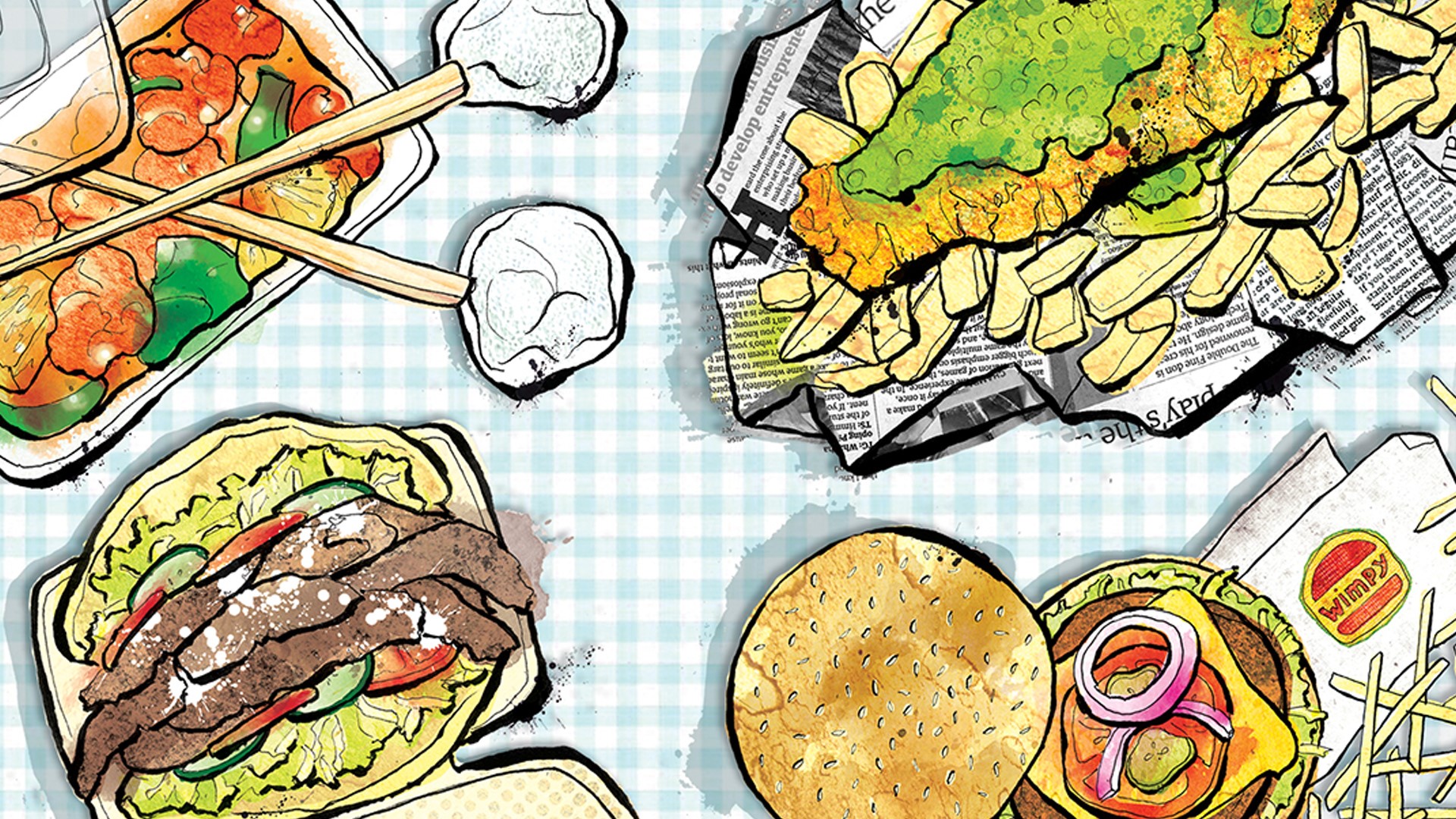
We ask three food illustrators working in editorial, branding and television about their inspirations, styles and the recipe for good work.
“I love cooking, and eating even more,” says illustrator Tom Hovey, as he tells Design Week about making pilgrimages to the street food markets of Bristol with his studio colleagues.
You may have seen Hovey’s work before – he creates the illustrations on Channel 4’s Great British Bake Off. Hovey has been with the show since its launch a decade ago on BBC Two.
It’s a gig that takes up most of the year – once he’s done illustrating for the main show, then come its spin offs: Junior Bake Off, The Stand Up to Cancer Celebrity Bake Off, The Great American Bake Off and an array of Christmas specials. Add to all of this Bake Off colouring books, PR campaigns, official Twitter emojis, as well as his commissions outside of the show, and you get an idea as to just how much time Hovey spends illustrating food.
Creatives like Hovey have been drawing food for centuries, if not millennia: from still life food paintings of the renaissance, to kitsch cookbooks of the 1970s. Indeed, drawings of food can even be found on the walls of Ancient Egyptian pyramids.
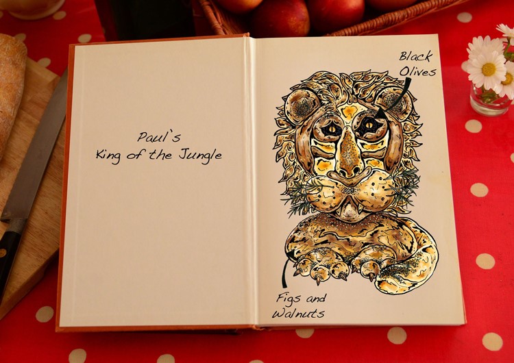 Paul’s King of the Jungle, by Tom Hovey. Credit: Love Productions
“Anything but food illustration”
In 2020, the craft of food illustration is as diverse as the ingredients it shows. Illustrators are brought in for branding work, animation, to design menus and restaurant graphics, for editorial and print pieces and, in Hovey’s case, even television work.
Food illustration hasn’t always been Hovey’s thing – before landing Bake Off, he admits he was doing “anything but food illustration”. Now however, it’s his “main focus”, and since the show’s launch in 2010 he has drawn quite literally hundreds of cakes and pastries, buns and bread loaves. The process, he says, has remained much the same throughout the years.
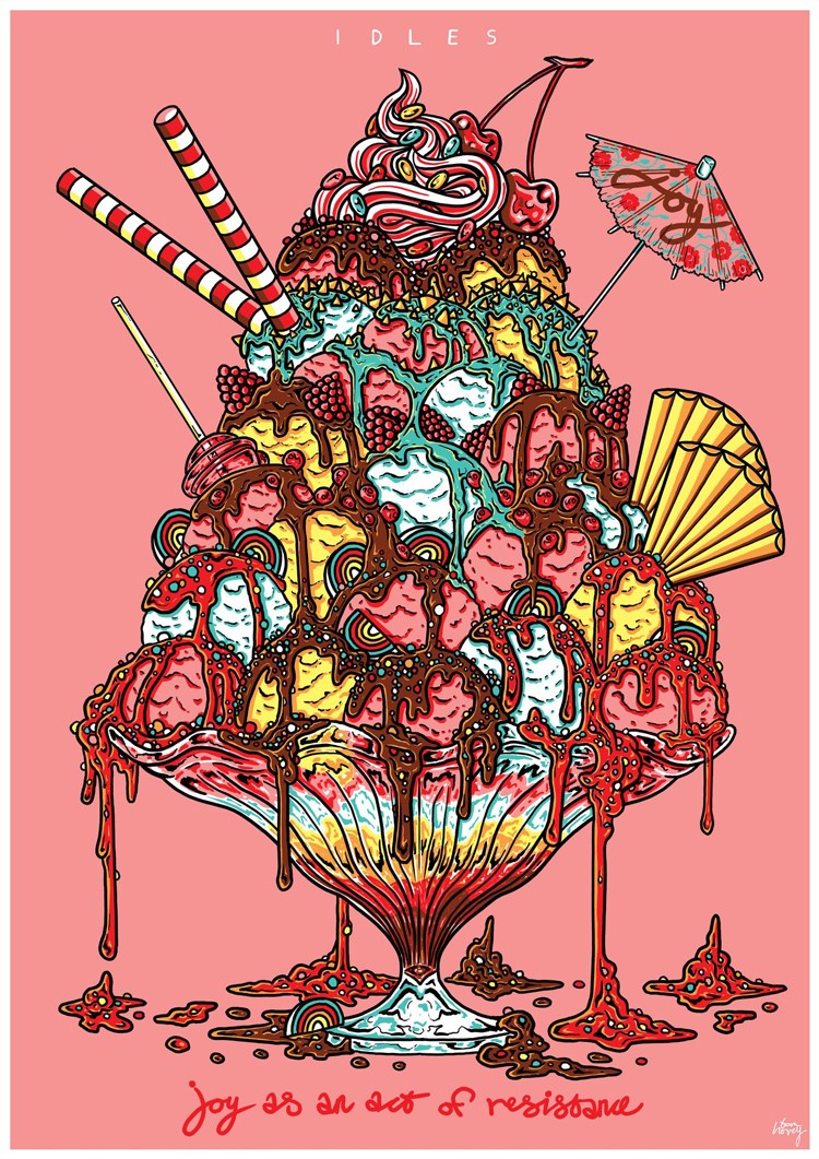 Work done for the band Idles, by Tom Hovey
“I’m sent the photos of the finished bakes from various angles so I can get a good idea of the whole thing,” Hovey tells Design Week, adding that his job is to illustrate what contestants planned to create, not necessarily what they ended up baking. “If the bakes don’t go as planned, I have to work out with the producers and the bakers how to fix the issues, add missing elements, extra layers.”
The brief may not have changed, but the illustrator’s methods have. Having started out on Bake Off with an “actual real-life pencil”, he now works digitally on a tablet and in Photoshop. He credits the show as being a medium through which he could “refine and update” his style – a style he says was “born out of painting murals on the walls of abandoned shops and trendy ad agencies in Soho in the noughties”.
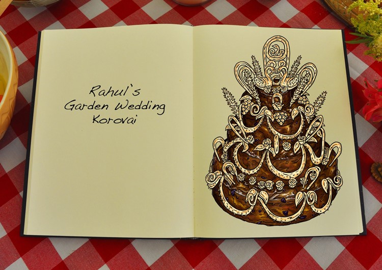 Rahul’s Garden Wedding Korovai, by Tom Hovey. Credit: Love Productions
“The supermarket is the most colourful thing you’ll see”
The story of Hovey’s journey into food illustration is one full of serendipity – he moved to London in 2009 with no job lined up, when a friend got him a job working in the edit of a new amateur baking show on BBC Two. When the editor and series director discussed adding animated illustrations, he pitched for the job and got it.
Serendipity was less of a factor for food illustrator and designer Marianna Fierro. Having grown up in a pizza shop in Northern Italy, she says she has “always been around and appreciated food”.
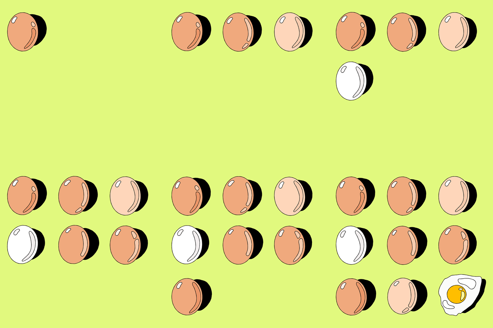 Animation by Marianna Fierro
In her own practice, New York-based Fierro focuses mainly on produce and her Instagram and website are shrines to fresh fruit and vegetables. She tells Design Week this is both because of her Italian childhood and roots, and the positive associations she has with produce and good mental health.
“Fruits and vegetables come in so many shapes and forms that they feel inherently very accepting,” she says. “And when you’re living in a big city, especially in the depths of winter, often the produce aisle in the supermarket is the most colourful thing you’ll see.”
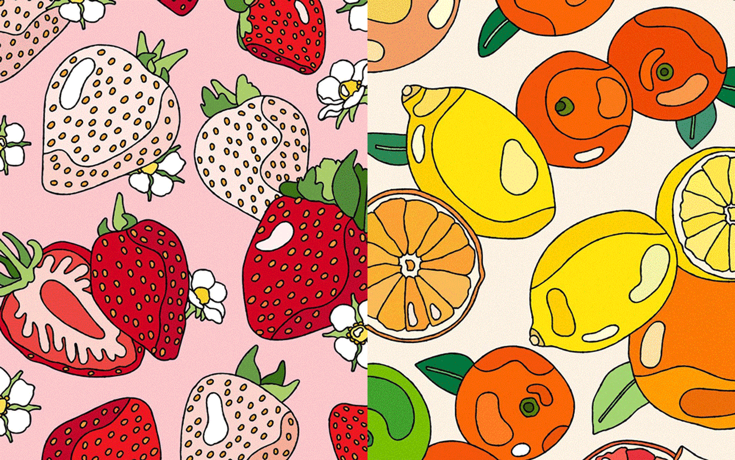 Animation by Marianna Fierro
“Different ingredients to make the final dish”
Until last year, food illustration was something Fierro did just for herself, since her US visa meant she was unable to pick up freelance commissions. Now that she can, she says she mainly finds work with brands, be it focusing on new products or wider identity work.
Because she works with different brands, Fierro explains her illustration style is necessarily fluid. She doesn’t want to “box herself in”, she says, since “different people reach out having liked different iterations” of her work. Like her illustration style, the jobs themselves can vary.
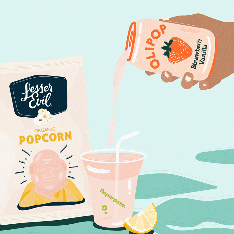 Work done for Olipop, by Marianna Fierro
“Some clients come to me as an artist – they’ll say: ‘We’ve seen your work, we trust you, this is the colour palette, you do you’,” she says. Other times, there’s an art director involved giving feedback and recommendations. Every experience however, is “good for learning”.
Fittingly, Fierro says the process for any job is like a recipe: “I think of my references, style, equipment and mise en place all as different ingredients to make the final dish.”
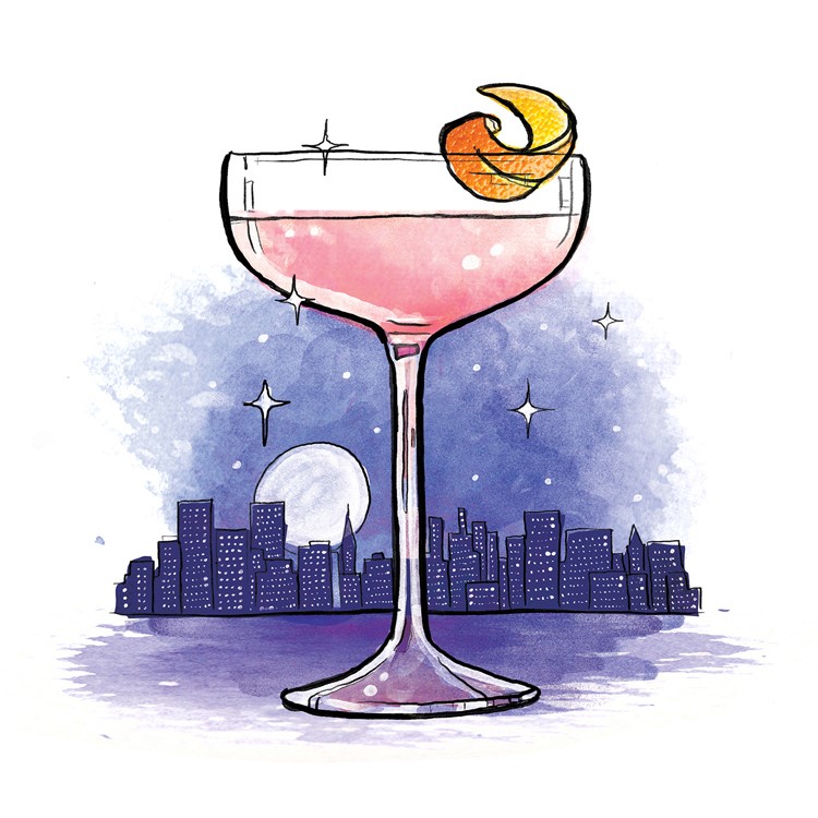 Cosmopolitan, work done for Virgin Atlantic, by Lisa Maltby
“More than just a visual”
While Fierro’s style has the capacity to change from job to job, she says it is always rooted in “playfulness” – whether that’s animations of wobbly eggs or so-sweet-you-can-almost-taste-it pieces for brands like health drink brand Olipop.
“Anything I create for a client comes from a place of trying to replicate the energy and happiness I get from interacting with food,” she says.
 Editorial work done by Lisa Maltby for Top Santé
This is echoed by fellow food illustrator, Lisa Maltby, who emphasises to us how images of food “always conjure up more than just a visual”.
“You imagine how it smells and tastes, or it brings up memories of eating meals with others,” she says. “I think that’s why so many people connect with illustrations of food, because it hits on so many levels.”
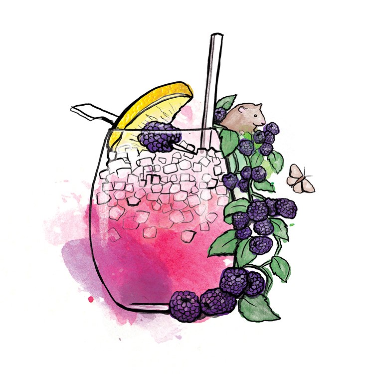 Bramble, work done for Virgin Atlantic, by Lisa Maltby
“Not giving too much away gives people something to interpret”
Initially, Maltby found most of her food work in editorial and has illustrated pieces in the likes of Delicious magazine (featured in the banner of this page), Waitrose Food and Weight Watchers magazine, as well as several books. Now, she says her work also crosses over into design. She works with restaurants to create menus and brands to create packaging, websites and wider visual communications.
One thing she, and indeed all food illustrators, have to think about is realism. By its nature, illustration is of course a step removed from reality; if clients want hyper-realistic imagery, they’re better suited opting for photography. Striking a personal balance is key, Maltby says.
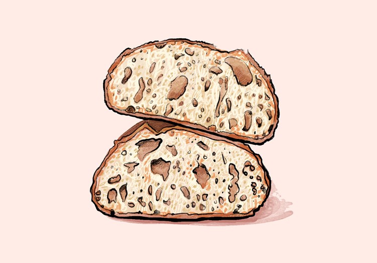
Work by Lisa Maltby
“I used to create hyper-realist illustrations, but I found more freedom in the work when I added my own expression,” she says. “I think not giving too much away also gives people something to interpret.”
Because of this, Maltby says some of her favourite commissions are the ones that blend “observation with something from the imagination”. Her past work with Virgin Atlantic on its club magazine, in which she created whimsical scenes of landmarks and skylines alongside fancy cocktails hit this perfectly: “I was able to add an element of surrealism and fun”.
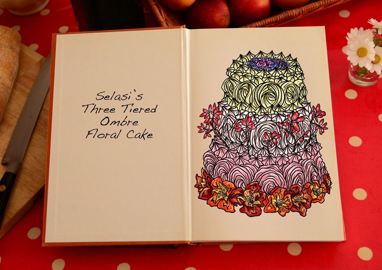 Selasi’s Three Tiered Ombre Floral Cake, by Tom Hovey. Credit: Love Productions
“Drawing it feels almost sacred”
There’s no set way into the practice – Hovey, for example, began his creative career painting murals in the street art scene of the mid-to-late 2000s; Fierro was (and still is) a designer, before she moved into food illustration. One thing that does help, unsurprisingly, is a passion for food.
Hovey is a self-confessed “massive foodie”: “I have folders on my Dropbox full of photos from friends who are chefs who send me process pictures, finished meals and anything they think I might find inspiring.”
With her pizza shop background, Fierro says her appreciation for food comes not just from a culinary standpoint, but from “the way I’ve seen it bring people together”.
As for Maltby, she reflects on its simplicity: “Food is such a basic essential, yet drawing it feels almost sacred somehow – I think it gives me an appreciation of it.”
By Molly Long August 6, 2020
Source: Design Week
