Logo Rhythm: New Book Celebrates Band Logos That Rocked the World
In his day job, Jamie Ellul is the creative director at Supple Studio in Bath. But in his spare time, he's been working on an intriguing project with design writer Jim K Davies. It's a book with the self-explanatory title of Logo Rhythm – Band Logos That Rocked The World. Circa Press will publish it, and the pair have just launched a Kickstarter to help fund it.
The lovingly produced book features over 90 design stories behind iconic band logos and includes lots of new interviews with designers and musicians from the 1960s to now. And the elevator pitch is a simple one: "Album covers get all the praise, but the humble band logo has never quite got its full dues. Until now."
Across 440 pages, the authors salute 90-plus stone-cold classics, as well as some lesser-known gems. They've spent the past seven years digging deep to unearth the fascinating stories behind the band logos we know and love: how they came about, who designed them, what they mean, and why they rock.

In short, this is a must-read slice of music and design history. "Many of the band logo design trailblazers are no longer with us," Jamie points out. "Some of their stories have been lost in the mists of time. Our book does its damnedest to put this right. To give credit where it's due; to sing the praises of the unsung designer or guitarist or drummer's girlfriend who came up with the idea."
Inspiration and learnings
So, how did the idea come about? "Jim dreamed up the idea," reveals Jamie. "We're good friends, having worked on lots of projects together over the years, and he knew I was as much of a music nut as he is. Jim came up with the idea of bandlogojukebox.com – a blog that tells the often untold stories behind band logos – and as we started to populate it, we realised it would make a great book."
The pair designed some sample pages and started sending them around. "After a couple of false starts with bigger publishers, we discovered Circa Press, whose founder David Jenkins loved the book idea," says Jamie. "And here we are, two years and lots of writing later."
We wonder what they've learned about band logos along the way. "I think the main takeaway is that a lot of classic band logos weren't created by trained designers," Jamie responds. "In the book, there are so many stories of band members, friends, parents, roadies, etc., being the mastermind behind the marque. I love that there are no rules to it and that a great idea can come from anywhere."
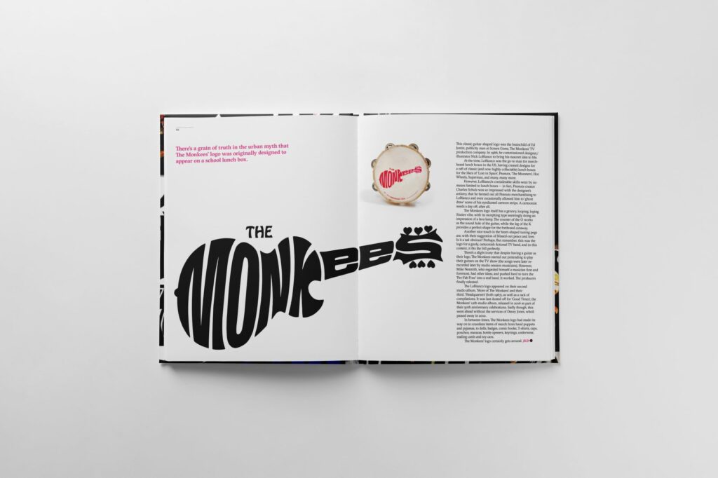
Another trend they found was that band logos often start on the drummer's bass drum skin. "Take the Beatles or the Kinks logos that we now think of as iconic," he points out. "Actually, those logos didn't appear on any album covers until 70s compilation records. They've become the official band logos almost after the event."
Labour of love
Like all the best side projects, it's been a labour of love from start to finish, he adds. "The joy of this process has been when we've managed to track down the designer behind the logo and give them a chance to tell their story, particularly those from way back," he enthuses.
"For instance, we managed to find two of the mural artists who worked on the Wings tour bus for Paul McCartney. That bus featured the now iconic Wings logo on the back, but according to mural artist Geoffrey Cleghorn, the logo wasn't even part of the original brief.
"His mate Neal Dean, who worked on the bus design with him, simply had an idea off-the-cuff, drew it with a Disney pencil and ruler borrowed from a kid, and they decided to chuck it in as part of the commission. It's gone on to be used on countless covers and posters, but it was never even supposed to exist."
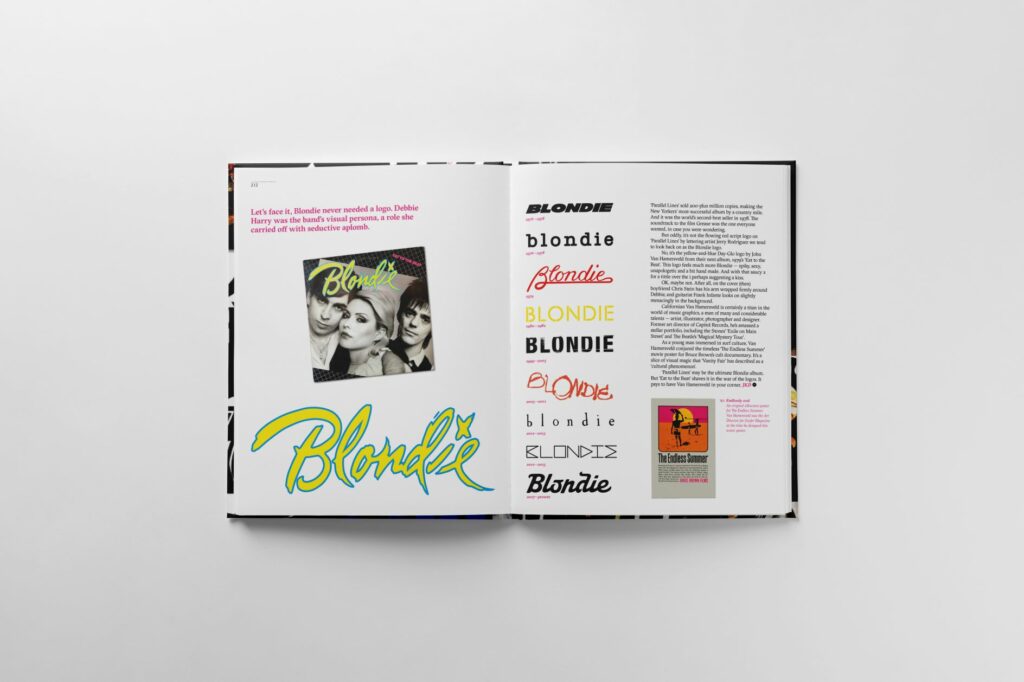
There are so many stories like this in the book, he explains. "The haphazard, messy nature of the music business seems to result in these accidental classics that we all know and love. It's these stories that really make the book unique."
We can't leave without asking the obvious final question: what's his favourite band logo? "Oh, that's a tough question for sure," Jamie responds. "I think it might have to be Geoff Halpin's logo for UFO.
"Geoff used to work with Hipgnosis back in the '60s and '70s, and his idea for the UFO logo was based around static interference," he explains. "The interference that might happen if aliens came to Earth and tried to communicate with us. I just find the glitchy typographic solution so timeless and perfect. It's hard to beat. Geoff also dug out the original hand-drawn artwork from his loft, so that's in the book, and it's a beautiful thing in its own right."
How to buy the book
Written and edited by Jim and designed and co-written by Jamie, the book includes contributions from luminaries of the design and music industries.
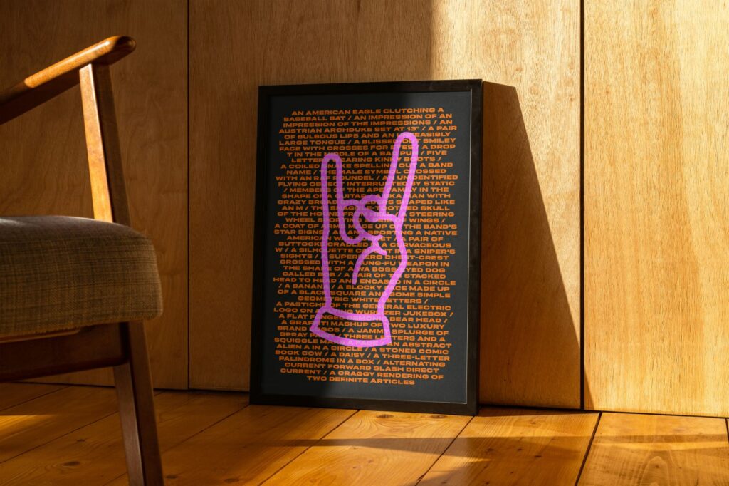
There are two forewords, one by broadcaster and songwriter Tom Robinson, the other by graphics guru Malcolm Garrett. Plus, designers who've contributed include Jonathan Barnbrook, Kosh, John Pache, Rob O'Connor, Michael Johnson, Matt Cooper, Mark Porter, Craig Ward and Chris Bigg.
Musicians involved, meanwhile, include Mick Avory of The Kinks, Horace Panter of The Specials, Jim McCarty of The Yardbirds, Alex Kapranos of Franz Ferdinand and Alan Gorrie of Average White Band.
To pledge, visit the book's Kickstarter page. Rewards include custom pin badges, T-shirts, art prints, and the chance to get your band logo designed by Supple Studio.
Source: creativeboom.com
